Statistics Essentials: Who Reads Novels?
Contents
Statistics Essentials: Who Reads Novels?#
Introduction#
This chapter describes the calculation and use of common summary statistics. Summary statistics such as the mean, median, and standard deviation aspire to capture salient characteristics of a collection of values or, more precisely, characteristics of an underlying (perhaps hypothesized) probability distribution generating the observed values. Summary statistics are a bit like paraphrases or abstracts of texts. With poetry you almost always want the poem itself (akin to knowledge of the underlying distribution) rather than the paraphrase (the summary statistic(s)). If, however, a text, such as a novel, is extremely long or staggeringly predictable, you may be willing to settle for a paraphrase. Summary statistics serve a similar function: sometimes we don’t have sufficient time or (computer) memory to analyze or store all the observations from a phenomenon of interest and we settle for a summary, faute de mieux. In other fortuitous cases, such as when we are working with data believed to be generated from a normal distribution, summary statistics may capture virtually all the information we care about. Summary statistics, like paraphrases, also have their use when communicating the results of an analysis to a broader audience who may not have time or energy to examine all the underlying data.
This chapter reviews the use of summary statistics to capture the location—often the “typical” value—and dispersion of a collection of observations. The use of summary statistics to describe the association between components of multivariate observations is also described. These summary statistics are introduced in the context of an analysis of survey responses from the United States General Social Survey (GSS). We will focus, in particular, on responses to a question about the reading of literature. We will investigate the question of whether respondents with certain demographic characteristics (such as higher than average income or education) are more likely to report reading novels (within the previous twelve months). We will start by offering a definition of a summary statistic before reviewing specific examples which are commonly encountered. As we introduce each statistic, we will offer an example of how the statistic can be used to analyze the survey responses from the GSS. Finally, this chapter also introduces a number of common statistics to characterize the relationship between variables.
A word of warning before we continue. The following review of summary statistics and their use is highly informal. The goal of the chapter is to introduce readers to summary statistics frequently encountered in humanities data analysis. Some of these statistics lie at the core of applications that will be discussed in subsequent chapters in the book, such as the one on stylometry (see chapter Stylometry and the Voice of Hildegard). A thorough treatment of the topic and, in particular, a discussion of the connection between summary statistics and parameters of probability distributions are found in standard textbooks (see e.g., chapter 6 of Casella and Berger [2001]).
Statistics#
A formal definition of a statistic is worth stating. It will, with luck, defamiliarize concepts we may use reflexively, such as the sample mean and sample standard deviation. A statistic is a function of a collection of observations, \(x_1, x_2, \ldots, x_n\). (Such a collection will be referenced concisely as \(x_{1:n}\).) For example, the sum of a sequence of values is a statistic. In symbols we would write this statistic as follows:
Such a statistic would be easy to calculate using Python given a list of numbers x with sum(x).
The maximum of a sequence is a statistic. So too is the sequence’s minimum. If we were to flip a coin 100 times and record what happened (i.e., “heads” or “tails”), statistics of interest might include the proportion of times “heads” occurred and the total number of times “heads” occurred. If we encode “heads” as the integer 1 and “tails” as the integer 0, the statistic above, \(T(x_{1:n})\), would record the total number of times the coin landed “heads”.
Depending on your beliefs about the processes generating the observations of interest, some statistics may be more informative than others. While the mean of a sequence is an important statistic if you believe your data comes from a normal distribution, the maximum of a sequence is more useful if you believe your data were drawn from a uniform distribution. A statistic is merely a function of a sequence of observed values. Its usefulness varies greatly across different applications.
Note
Those with prior exposure to statistics and probability should note that this definition is a bit informal. If the observed values are understood as realized values of random variables, as they often are, then the statistic itself is a random quantity. For example, when people talk about the sampling distribution of a statistic, they are using this definition of a statistic.
There is no formal distinction between a summary statistic and statistic in the sense defined above. If someone refers to a statistic as a summary statistic, however, odds are strongly in favor of that statistic being a familiar statistic widely used to capture location or dispersion, such as mean or variance.
Summarizing Location and Dispersion#
In this section we review the definitions of the statistics discussed below, intended to capture location and dispersion: mean, median, variance, and entropy. Before we describe these statistics, however, let us introduce the data we will be working with.
Data: Novel reading in the United States#
To illustrate the uses of statistics, we will be referring to a dataset consisting of survey responses from the General Social Survey (GSS) during the years 1998 and 2002. In particular, we will focus on responses to questions about the reading of literature. The GSS is a national survey conducted in the United States since 1972. (Since 1994 the GSS has been conducted on even numbered years.) In 1998 and 2002 the GSS included questions related to culture and the arts.1 The GSS is particularly useful due to its accessibility—anyone may download and share the data—and due to the care with which it was assembled—the survey is conducted in person by highly trained interviewers. The GSS is also as close to a simple random sample of households in the United States (current population ~320 million) as it is feasible to obtain.2 Given the size and population of the United States, that the survey exists at all is noteworthy. Random samples of individuals such as those provided by the GSS are particularly useful because with them it is easy to make educated guesses both about characteristics of the larger distribution and the variability of the aforementioned guesses. For example, given a random sample from a normal distribution it is possible to estimate both the mean and the variability of this same estimate (the sampling error of the mean).
In 1998 and 2002 respondents were asked if, during the last twelve months, they “[r]ead novels, short stories, poems, or
plays, other than those required by work or school”. Answers were recorded in the readfict variable.
(Those familiar with GSS will want to know these, because this question was asked
as part of a larger survey, we have considerable additional demographic information about each person responding to the survey. This information allows us to create a compelling picture of people who are likely to say they read prose
fiction.
In addition to responses to the questions concerning reading activity and concert attendance, we will look at the following named variables from the sample:
age: Age of respondentsex: Sex of respondent (recorded by survey workers)race: Race of respondent (verbatim response to the question “What race do you consider yourself?”)reg16: Region of residence when 16 years old (New England, Middle Atlantic, Pacific, etc.) A map showing the nine regions (in addition to “Foreign”) is included below.degree: Highest educational degree earned (None, High School, Bachelor, Graduate degree)realrinc: Respondent’s income in constant dollars (base = 1986)
Tip
The GSS contains numerous other variables which might form part of an interesting analysis. For
example, the variable educ records the highest year of school completed and res16 records the type of place
the respondent lived in when 16 years old (e.g., rural, suburban, urban, etc.).
Note
“Race”, in the context of the GSS, is defined as the verbatim response of the interviewee to the question, “What race do you consider yourself?” In other settings the term may be defined and used differently. For example, in another important survey, the United States Census, in which many individuals are asked a similar question, the term is defined according to a 1977 regulation which references ancestry [Council, 2004]. The statistical authority in Canada, the other large settler society in North America, discourages the use of the term entirely. Government statistical work in Canada makes use of variables such as “visible minority” and “ethnic origin”, each with their own complex and changing definitions [Government of Canada, 1998, Government of Canada, 2015].
The GSS survey results are distributed in a variety of formats. In our case, the GSS dataset resides in a file named
GSS7214_R5.DTA. The file uses an antiquated format from Stata, a proprietary non-free statistical software package.
Fortunately, the Pandas library provides a function, pandas.read_stata(), which reads files using this format. Once we load
the dataset we will filter the data so that only the variables and survey responses of interest are included. In this
chapter, we are focusing on the above-mentioned variables from the years 1998, 2000, and 2002.
# Dataset GSS7214_R5.DTA is stored in compressed form as GSS7214_R5.DTA.gz
import gzip
import pandas as pd

with gzip.open('data/GSS7214_R5.DTA.gz', 'rb') as infile:
    # we restrict this (very large) dataset to the variables of interest
    columns = ['id', 'year', 'age', 'sex', 'race', 'reg16', 'degree',
               'realrinc', 'readfict']
    df = pd.read_stata(infile, columns=columns)

# further limit dataset to the years we are interested in
df = df.loc[df['year'].isin({1998, 2000, 2002})]
Most respondents provide answers to the questions asked of them. In some cases, however, respondents
either do not know the answer to a question or refuse to provide an answer to the question. When an
individual does not provide an answer to a question, the GSS data records that value as missing. In
a DataFrame such a value is recorded as NaN (“Not a Number”, a standard value elsewhere used
to encode undefined floating-point values). Although handling missing data adds additional
complexity to an analysis, the methods for dealing with such data in surveys are well established
(Hoff [2009], 115–123). Because missing data models are beyond the scope of this book we will
simply exclude records with missing values.
As the initial discussion of summary statistics describing location focuses on the responses to the
question about the respondent’s annual income, realrinc, a question which some people decline to
answer, we will exclude records with missing values for this variable using the code below:
# limit dataset to exclude records from individuals who refused
# to report their income
df = df.loc[df['realrinc'].notnull()]
As a final step, we need to adjust for inflation in the US dollar. Respondent’s income realrinc
is reported in constant 1986 US dollars. The following lines of code adjust the 1986 US
dollar quantities into 2015 terms. This is an important adjustment because the value of the US
dollar has declined considerably since 1986 due to inflation. Inflation is calculated using the US
Consumer Price Index which
estimates the value of a dollar in a given year by recording how many dollars are required to
purchase a typical “market basket” of goods regularly and widely consumed. Using the US CPI we can
say that 100 dollars worth of groceries for a typical family in 1986 is equivalent to 215 dollars in
2015, for instance.
# inflation measured via US Consumer Price Index (CPI), source:
# http://www.dlt.ri.gov/lmi/pdf/cpi.pdf
cpi2015_vs_1986 = 236.7 / 109.6
assert df['realrinc'].astype(float).median() < 24000  # reality check
df['realrinc2015'] = cpi2015_vs_1986 * df['realrinc'].astype(float)
After this preprocessing we can make a histogram showing annual family income, grouped by self-reported race (coded as “white”, “black”, or “other” by the GSS):
import matplotlib.pyplot as plt
df.groupby('race')['realrinc2015'].plot(kind='hist', bins=30)
plt.xlabel('Income')
plt.legend();
findfont: Font family ['sans-serif'] not found. Falling back to DejaVu Sans.
findfont: Generic family 'sans-serif' not found because none of the following families were found: "Roboto Condensed Regular"
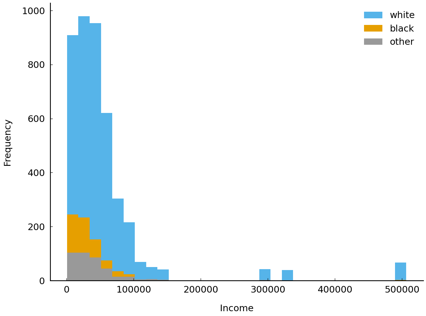
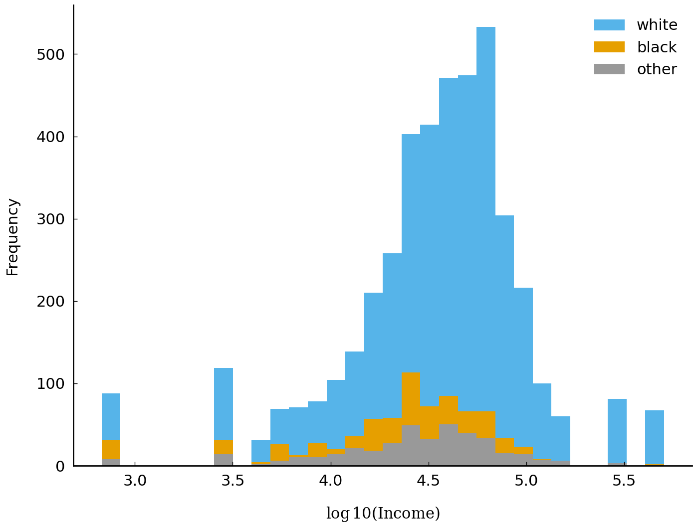
It is common practice to take the logarithm of data which are skewed or which, like income, are
commonly discussed in multiplicative terms (e.g., in North America and Europe it is far more common
to speak of a salary raise in percentage terms than in absolute terms). Converting data to a logarithmic scale has the benefit that larger differences in numeric quantities get mapped to a tinier scope. We will follow that practice
here. The following lines of code create a new variable realrinc2015_log10 and generate a new
plot using the variable. In the new plot below, it is easier to visually estimate the typical annual
household income for each group. We can see, for example, that the typical income associated with
respondents who describe themselves as “white” is higher than the typical income associated with
respondents describing themselves as something other than “white”.
import numpy as np

df['realrinc2015_log10'] = np.log10(df['realrinc2015'])
df.groupby('race')['realrinc2015_log10'].plot(kind='hist', bins=30)
plt.xlabel(r'$\log10(\mathrm{Income})$')
plt.legend();
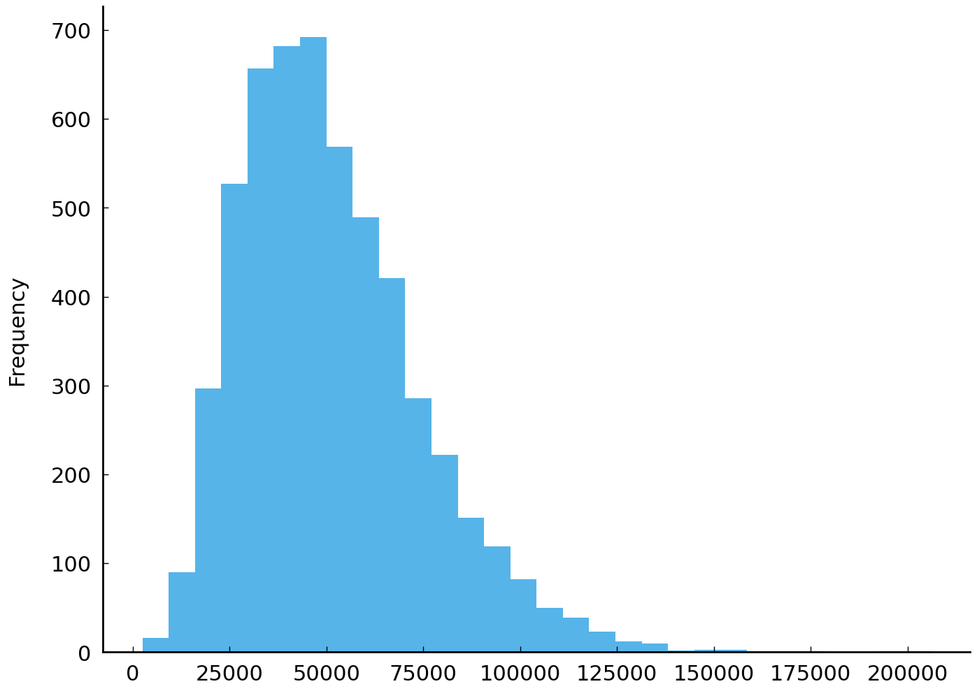
Location#
In the surveys conducted between 1998 and 2002, 5,447 individuals reported their annual income to survey workers. The histogram above shows their responses. In this section we will look at common strategies for summarizing the values observed in collections of samples such as the samples of reported household incomes. These strategies are particularly useful when we have too many observations to visualize or when we need to describe a dataset to others without transferring the dataset to them or without using visual aids such as histograms. Of course, it is difficult to improve on simply giving the entire dataset to an interested party: the best “summary” of a dataset is the dataset itself.
There is a great deal of diversity in reported household income. If we wanted to summarize the
characteristics we see, we have several options. We might report the ratio of the maximum value to
the lowest value, since this is a familiar kind of summary from the news in the present decade of the
twenty-first century: one often hears about the ratio of the income of the highest-paid employee at a
company to the income of the lowest-paid employee. In this case, the ratio can be calculated using
the max() and min() methods associated with the series (an instance of pandas.Series). Using
these methods accomplishes the same thing as using numpy.min() or numpy.max() on the underlying series.
print(df['realrinc2015'].max() / df['realrinc2015'].min())
749.1342599999999
This shows that the wealthiest individual in our sample earns ~750 times more than the poorest individual. This ratio has a disadvantage: it tells us little about the values between the maximum and the minimum. If we are interested in, say, the number of respondents who earn more or less than $30,000, this ratio is not an immediately useful summary.
To address this issue, let us consider more familiar summary statistics. Initially we will focus on two summary statistics which aim to capture the “typical” value of a sample. Such statistics are described as measuring the location of a distribution. (A reminder about terminology: a sample is always a sample from some underlying distribution.)
The first statistic is the average or arithmetic mean. The arithmetic mean is the sum of observed values divided by the number of values. While there are other “means” in circulation (e.g., geometric mean, harmonic mean), it is the arithmetic mean which is used most frequently in data analysis in the humanities and social sciences. The mean of \(n\) values (\(x_1, x_2, \ldots, x_n\)) is often written as \(\bar x\) and defined to be:
In Python, the mean can be calculated in a variety of ways: the pandas.Series method mean(),
the numpy.ndarray method mean(), the function statistics.mean(), and the function
numpy.mean(). The following line of code demonstrates how to calculate the mean of our
realrinc2015 observations:
print(df['realrinc2015'].mean())
51296.749024906276
The second widely used summary statistic is the median. The median value of a sample or distribution is the middle value: a value which splits the sample in two equal parts. That is, if we order the values in the sample from least to greatest, the median value is the middle value. If there are an even number of values in the sample, the median is the arithmetic mean of the two middle values. The following shows how to calculate the median:
print(df['realrinc2015'].median())
37160.92814781022
These two measures of location, mean and median, are often not the same. In this case they differ by a considerable amount, more than $14,000. This is not a trivial amount; $14,000 is more than a third of the typical annual income of an individual in the United States according to the GSS.
Consider, for example, the mean and the median household incomes for respondents with bachelor’s degrees in 1998, 2000, and 2002. Since our household income figures are in constant dollars and the time elapsed between surveys is short, we can think of these subsamples as, roughly speaking, simple random samples (of different sizes) from the same underlying distribution. That is, we should anticipate that, after adjusting for inflation, the income distribution associated with a respondent with a bachelor’s degree is roughly the same; variation, in this case, is due to the process of sampling and not any meaningful changes in the income distribution.
df_bachelor = df[df['degree'] == 'bachelor']
# observed=True instructs pandas to ignore categories
# without any observations
df_bachelor.groupby(['year', 'degree'], observed=True)['realrinc2015'].agg(['size', 'mean', 'median'])
| size | mean | median | ||
|---|---|---|---|---|
| year | degree | |||
| 1998 | bachelor | 363 | 63805.508302 | 48359.364964 |
| 2000 | bachelor | 344 | 58819.407571 | 46674.821168 |
| 2002 | bachelor | 307 | 85469.227956 | 50673.992929 |
We can observe that, in this sample, the mean is higher than the median and also more variable. This provides a taste of the difference between these statistics as summaries. To recall the analogy we began with: if summary statistics are like paraphrases of prose or poetry, the mean and median are analogous different strategies for paraphrasing.
Given this, information we are justified in asking why the mean, as a strategy for summarizing data, is so familiar and, indeed, more familiar than other summary statistics such as the median. One advantage of the mean is that it is the unique “right” guess if you are trying to pick a single number which will be closest to a randomly selected value from the sample when distance from the randomly selected value is penalized in proportion to the square of the distance between the number and the randomly selected value. The median does not have this particular property.
A dramatic contrast between the median and mean is visible if we consider what happens if our data has one or more corrupted values. Let’s pretend that someone accidentally added an extra “0” to one of the respondent incomes when they were entering the data from the survey worker into a computer. (This particular error is common enough that it has a moniker: it is an error due to a “fat finger”.) That is, instead of $143,618, suppose the number $1,436,180 was entered. This small mistake has a severe impact on the mean:
realrinc2015_corrupted = [11159, 13392, 31620, 40919, 53856, 60809, 118484, 1436180]
print(np.mean(realrinc2015_corrupted))
220802.375
By contrast, the median is not changed:
print(np.median(realrinc2015_corrupted))
47387.5
Because the median is less sensitive to extreme values it is often labeled a “robust” statistic.
An additional advantage of the median is that it is typically a value which actually occurs in the dataset. For example, when reporting the median income reported by the respondents there is typically at least one household with an income equal to the median income. With respect to income, this particular household is the typical household. In this sense there is an identified household which receives a typical income or has a typical size. By contrast, there are frequently no households associated with a mean value. The mean number of children in a household might well be 1.5 or 2.3, which does not correspond to any observed family size.
If transformed into a suitable numerical representation, categorical data can also be described
using the mean. Consider the non-numeric responses to the readfict question. Recall that the
readfict question asked respondents if they had read any novels, short stories, poems, or plays
not required by work or school in the last twelve months. Responses to this question were either “yes”
or “no”. If we recode the responses as numbers, replacing “no” with 0 and “yes” with 1, nothing
prevents us from calculating the mean or median of these values.
readfict_sample = df.loc[df['readfict'].notnull()].sample(8)['readfict']
readfict_sample = readfict_sample.replace(['no', 'yes'], [0, 1])
readfict_sample
37731    0
42612    1
37158    1
35957    1
41602    1
42544    1
35858    0
36985    1
Name: readfict, dtype: int64
print("Mean:", readfict_sample.mean())
print("Median:", readfict_sample.median())
Mean: 0.75
Median: 1.0
Dispersion#
Just as the mean or median can characterize the “typical value” in a series of numbers, there also exist many ways to describe the diversity of values found in a series of numbers. This section reviews descriptions frequently used in quantitative work in the humanities and social sciences.
import matplotlib.pyplot as plt

df['realrinc2015'].plot(kind='hist', bins=30);
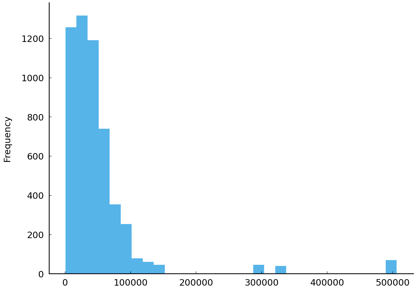
The plot shows all respondents’ reported household income. The mean income is roughly $51,000. Reported incomes vary considerably. Contrast the figure above with the histogram of a fictitious set of simulated incomes below:
# simulate incomes from a gamma distribution with identical mean
alpha = 5
sim = np.random.gamma(alpha, df['realrinc2015'].mean() / alpha, size=df.shape[0])
sim = pd.Series(sim, name='realrinc2015_simulated')
sim.plot(kind='hist', bins=30);
The two series visualized above may look different, but they are also similar. For example, they each have the same number of observations (\(n\) = 5447) and a common mean. But the observations clearly come from different distributions. The figures make clear that one series is more concentrated than the other. One way to quantify this impression is to report the range of each series. The range is the maximum value in a series minus the minimum value.
# Name this function `range_` to avoid colliding with the built-in
# function `range`.
def range_(series):
    """Difference between the maximum value and minimum value."""
    return series.max() - series.min()


print(f"Observed range: {range_(df['realrinc2015']):,.0f}\n"
      f"Simulated range: {range_(sim):,.0f}")
Observed range: 505,479
Simulated range: 203,543
The range of the fictitious incomes is much less than the range of the observed respondent incomes.
Another familiar measure of the dispersion of a collection of numeric values is the sample
variance and its square root, the sample standard deviation. Both of these are available for Pandas Series:
print(f"Observed variance: {df['realrinc2015'].var():.2f}\n"
      f"Simulated variance: {sim.var():.2f}")
Observed variance: 4619178856.92
Simulated variance: 536836056.00
print(f"Observed std: {df['realrinc2015'].std():.2f}\n"
      f"Simulated std: {sim.std():.2f}")
Observed std: 67964.54
Simulated std: 23169.72
The sample variance is defined to be, approximately, the mean of the squared deviations from the mean. In symbols this reads:
The \(n-1\) in the denominator (rather than \(n\)) yields a more reliable estimate of the variance of
the underlying distribution. When dealing with a large number of observations the
difference between \(\frac{1}{n-1}\) and \(\frac{1}{n}\) is negligible. The std() methods of a
DataFrame and Series use this definition as does Python’s statistics.stdev().
Unfortunately, given the identical function name, numpy.std() uses a different definition and must be
instructed, with the additional parameter ddof=1 to use the corrected estimate. The following
block of code shows the various std functions available and their results.
# The many standard deviation functions in Python:
import statistics

print(f"statistics.stdev: {statistics.stdev(sim):.1f}\n"
      f"         sim.std: {sim.std():.1f}\n"
      f"          np.std: {np.std(sim):.1f}\n"
      f"  np.std(ddof=1): {np.std(sim, ddof=1):.1f}")
statistics.stdev: 23169.7
         sim.std: 23169.7
          np.std: 23167.6
  np.std(ddof=1): 23169.7
Other common measures of dispersion include the mean absolute deviation (around the mean) and the interquartile range
(IQR). The mean absolute deviation is defined, in symbols, as \(\frac{1}{n} \sum_{i=1}^n \lvert x_i - \bar x \rvert\). In
Python we can calculate the mean absolute deviation using the mad() method associated with the Series and
DataFrame classes. In this case we could write: df['realinc'].mad(). The IQR is the difference between the upper
and lower quartiles (the interquartile range or IQR). The IQR may be familiar from the boxplot visualization. Box
plots use the IQR to bound the rectangle (the “box”). In our series, the 25th percentile is $20,000 and the 75th
percentile is $61,000. The boxes in the box plots shown in figure Box plots of observed and simulated values for household income in constant 2015 US dollars. have width equal to the
IQR.
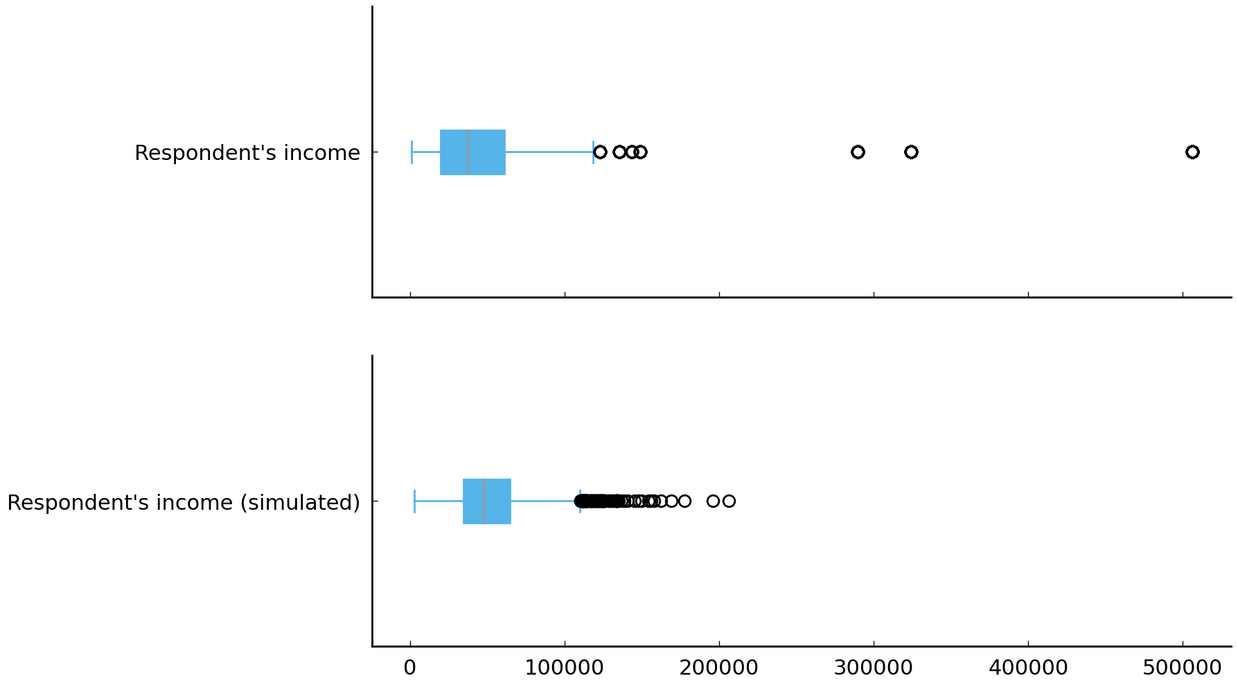
Fig. 12 Box plots of observed and simulated values for household income in constant 2015 US dollars.#
Depending on the context, one measure of dispersion may be more appropriate than another. While the range is appealing for its simplicity, if the values you are interested in might be modeled as coming from a distribution with heavy or long “tails” then the range can be sensitive to sample size.
Equipped with several measures of dispersion, we can interrogate the GSS and ask if we see patterns in income that we anticipate seeing. Is income more variable among respondents who graduate from university than it is among respondents whose highest degree is a high school diploma? One piece of evidence which would be consistent with an affirmative answer to the question would be seeing greater mean absolute deviation of income among respondents with a bachelor’s degree than among respondents with only a high school diploma:
df.groupby('degree')['realrinc2015'].mad().round()
degree
lt high school    19551.0
high school       23568.0
junior college    33776.0
bachelor          45055.0
graduate          77014.0
Name: realrinc2015, dtype: float64
Given the question we began this chapter with, we might also investigate whether or not there is an association with reading fiction and variability in respondents’ incomes. To keep things simple, we will limit ourselves to respondents with bachelor’s or graduate degrees:
df_bachelor_or_more = df[df['degree'].isin(['bachelor', 'graduate'])]
df_bachelor_or_more.groupby(['degree', 'readfict'], observed=True)['realrinc2015'].mad().round()
degree    readfict
bachelor  yes          48908.0
          no          119523.0
graduate  yes          82613.0
          no          133028.0
Name: realrinc2015, dtype: float64
The greater variability is being driven largely by the fact that respondents who do not report reading fiction tend to earn more. Looking at the means of these subgroups offers additional context:
df_bachelor_or_more.groupby(['degree', 'readfict'], observed=True)['realrinc2015'].mean().round()
degree    readfict
bachelor  yes          71251.0
          no          139918.0
graduate  yes         113125.0
          no          153961.0
Name: realrinc2015, dtype: float64
One can imagine a variety of narratives or generative models which might offer an account of this difference. Checking any one of these narratives would likely require more detailed information about individuals than is available from the GSS.
The question of who reads (or writes) prose fiction has been addressed by countless researchers. Well-known studies include Hoggart [1957], Williams [1961], Radway [1991], and Radway [1999]. Felski [2008] and Collins [2010] are examples of more recent work. Useful general background on the publishing industry during the period when the surveys were fielded can be found in Thompson [2012].
Variation in categorical values#
Often we want to measure the diversity of categorical values found in a dataset. Consider the following three imaginary groups of people who report their educational background in the same form that is used on the GSS. There are three groups of people, and there are eight respondents in each group.
group1 = ['high school', 'high school', 'high school', 'high school', 'high school',
          'high school', 'bachelor', 'bachelor']
group2 = ['lt high school', 'lt high school', 'lt high school', 'lt high school',
          'high school', 'junior college', 'bachelor', 'graduate']
group3 = ['lt high school', 'lt high school', 'high school', 'high school',
          'junior college', 'junior college', 'bachelor', 'graduate']
# calculate the number of unique values in each group
print([len(set(group)) for group in [group1, group2, group3]])
# calculate the ratio of observed categories to total observations
print([len(set(group)) / len(group) for group in [group1, group2, group3]])
[2, 5, 5]
[0.25, 0.625, 0.625]
The least diverse group of responses is group 1. There are only two distinct values (“types”) in group 1 while there are five distinct values in group 2 and group 3.
Counting the number (or proportion of) distinct values is a simple way to measure
diversity in small samples of categorical data. But counting the number of distinct values
only works with small samples (relative to the number of categories) of the same size. For example, counting the number of distinct degrees reported for each region in the United States will not work because all possible values occur at least once (i.e., five distinct degrees occur in each region). Yet we know that some regions have greater variability of degree types, as table Fig. 13 shows. To simplify things, Table Fig. 13 shows only three regions: East South Central, New England, and Pacific.
| degree | ||
|---|---|---|
| reg16 | ||
| new england | high school | 0.5 |
| bachelor | 0.3 | |
| graduate | 0.1 | |
| junior college | 0.1 | |
| lt high school | 0.1 | |
| e. sou. central | high school | 0.6 |
| lt high school | 0.1 | |
| bachelor | 0.1 | |
| junior college | 0.1 | |
| graduate | 0.1 | |
| pacific | high school | 0.5 |
| bachelor | 0.2 | |
| junior college | 0.1 | |
| graduate | 0.1 | |
| lt high school | 0.1 |
Fig. 13 Proportion of respondents in indicated region of the United States with named degree type. Data for three regions shown: East South Central, New England, and Pacific.#
We would still like to be able to summarize the variability in observed categories, even in situations when the number of distinct categories observed is the same. Returning to our three groups of people, we can see that group 2 and group 3 have the same number of distinct categories. Yet group 3 is more diverse than group 2; group 2 has one member of classes “high school”, “junior college”, “bachelor”, and “graduate”. This is easy to see if we look at a table of degree counts by group, Table 3.
Count |
||
|---|---|---|
Group 1 |
high school |
6 |
bachelor |
2 |
|
lt high school |
4 |
|
high school |
1 |
|
——— |
—————- |
——- |
Group 2 |
junior college |
1 |
bachelor |
1 |
|
graduate |
1 |
|
lt high school |
2 |
|
high school |
2 |
|
——— |
—————- |
——- |
Group 3 |
junior college |
2 |
bachelor |
1 |
|
graduate |
1 |
Fortunately, there is a measure from information theory which distills judgments of diversity among categorical values
into a single number. The measure is called entropy (more precisely, Shannon entropy). One way to appreciate how this measure works is to consider the task of identifying what category a survey respondent belongs to using only questions which have a “yes” or a “no” response. For example, suppose the category whose diversity you are interested in quantifying is highest educational degree and a survey
respondent from group2 has been selected at random. Consider now the following question: what is the minimum
number of questions we will have to ask this respondent on average in order to determine their educational background?
Group 2 has respondents with self-reported highest degrees shown above. Half the respondents have an educational
background of lt high school so half of the time we will only need to ask a single question, “Did you graduate from
high school?”, since the response will be “no”. The other half of the time we will need to ask additional questions. No
matter how we order our questions, we will sometimes be forced to ask three questions to determine a respondent’s
category. The number of questions we need to ask is a measure of the heterogeneity of the group. The more heterogeneous,
the more “yes or no” questions we need to ask. The less heterogeneous, the fewer questions we need to ask. In the
extreme, when all respondents are in the same category, we need to ask zero questions since we know which category a
randomly selected respondent belongs to.
If the frequency of category membership is equal, the average number of “yes or no” questions we need to ask is equal to the (Shannon) entropy. Although the analogy breaks down when the frequency of category membership is not equal, the description above is still a useful summary of the concept. And the analogy breaks down for very good reasons: although it is obvious that with two categories one must always ask at least one question to find out what category a respondent belongs to, we still have the sense that it is important to distinguish—as entropy does in fact do—between situations where 90% of respondents are in one of two categories and situations where 50% of respondents are in one of two categories.
Tip
A useful treatment of entropy for those encountering it for the first time is found in Frigg and Charlotte Werndl [2011].
While entropy is typically used to describe probability distributions, the measure is also used to describe samples. In the case of samples, we take the observed frequency distribution as an estimate of the distribution over categories of interest. If we have \(K\) categories of interest and \(p_k\) is the empirical probability of drawing an instance of type \(k\), then the entropy (typically denoted \(H\)) of the distribution is:
The unit of measurement for entropy depends on the base of the logarithm used. The base used in the calculation of entropy is either 2
or \(e\), leading to measurements in terms of “bits” or “nats” respectively. Entropy can be calculated in Python using the
function scipy.stats.entropy() which will accept a finite probability distribution or an
unnormalized vector of category counts. That scipy.stats.entropy() accepts a sequence of category
counts is particularly useful in this case since it is just such a sequence which we have been using
to describe our degree diversity.
The following block illustrates that entropy aligns with our expectations about the diversity of the
simulated groups of respondents (group1, group2, group3) mentioned earlier. (Note that
scipy.stats.entropy() measures entropy in nats by default.)
import collections
import scipy.stats

# Calculate the entropy of the empirical distribution over degree
# types for each group
for n, group in enumerate([group1, group2, group3], 1):
    degree_counts = list(collections.Counter(group).values())
    H = scipy.stats.entropy(degree_counts)
    print(f'Group {n} entropy: {H:.1f}')
Group 1 entropy: 0.6
Group 2 entropy: 1.4
Group 3 entropy: 1.6
As we can see, group1 is the least diverse and group3 is the most diverse. The diversity of
group2 lies between the diversity of group1 and group3. This is what we anticipated.
Now that we have a strategy for measuring the variability of observed types, all that remains is to apply it to the data of interest. The following block illustrates the use of entropy to compare the variability of responses to the degree question for respondents in different regions of the United States:
df.groupby('reg16')['degree'].apply(lambda x: scipy.stats.entropy(x.value_counts()))
reg16
foreign            1.505782
new england        1.345351
middle atlantic    1.321904
e. nor. central    1.246287
w. nor. central    1.211067
south atlantic     1.261397
e. sou. central    1.196932
w. sou. central    1.290568
mountain           1.214591
pacific            1.283073
Name: degree, dtype: float64
Looking at the entropy values we can see that respondents from the New England states report having a greater diversity of educational backgrounds than respondents in other states. Entropy here gives us similar information as the proportion of distinct values but the measure is both better aligned with our intuitions about diversity and usable in a greater variety of situations.
Measuring Association#
Measuring association between numbers#
When analyzing data, we often want to characterize the association between two variables. To return to the question we began this chapter with—whether respondents who report having certain characteristics are more likely to read novels—we might suspect that knowing that a region has an above average percentage of people with an advanced degree would “tell us something” about the answer to the question of whether or not an above average percentage has read a work of fiction recently. Informally, we would say that we suspect higher levels of education are associated with higher rates of fiction reading. In this section we will look at two formalizations of the idea of association: the correlation coefficient and the rank correlation coefficient.
In this section we have tried to avoid language which implies that a causal relationship exists between any two variables. We do not intend to discuss the topic of causal relationships in this chapter. Two variables may be associated for any number of reasons. Variables may also be associated by chance.
One association that is visible in the data is that older individuals tend to have higher incomes. To examine the relationship more closely we will first restrict our sample of the GSS to a relatively homogeneous population: respondents between the ages of 23 and 30 with a bachelor’s degree. To further restrict our sample to individuals likely to be employed full-time, we will also exclude any respondents with an annual income of less than $10,000. The first block of code below assembles the subsample. The second block of code creates a scatter-plot allowing us to see the relationship between age and income in the subsample.
df_subset_columns = ['age', 'realrinc2015_log10', 'reg16', 'degree']
min_income = 10_000
df_subset_index_mask = ((df['age'] >= 23) & (df['age'] <= 30) &
                        (df['degree'] == 'bachelor') &
                        (df['realrinc2015'] > min_income))
df_subset = df.loc[df_subset_index_mask, df_subset_columns]
# discard rows with NaN values
df_subset = df_subset[df_subset.notnull().all(axis=1)]
# age is an integer, not a float
df_subset['age'] = df_subset['age'].to_numpy().astype(int)
In the block of code above we have also removed respondents with NA values (non-response, “I don’t
know” responses, etc.) for degree or age. Without any NaN’s to worry about we can convert
age into a Series of integers (rather than floating-point values).
# Small amount of noise ("jitter") to respondents' ages makes
# discrete points easier to see
_jitter = np.random.normal(scale=0.1, size=len(df_subset))
df_subset['age_jitter'] = df_subset['age'].astype(float) + _jitter
ax = df_subset.plot(x='age_jitter', y='realrinc2015_log10', kind='scatter', alpha=0.4)
ax.set(ylabel="Respondent's income (log10)", xlabel="Age");
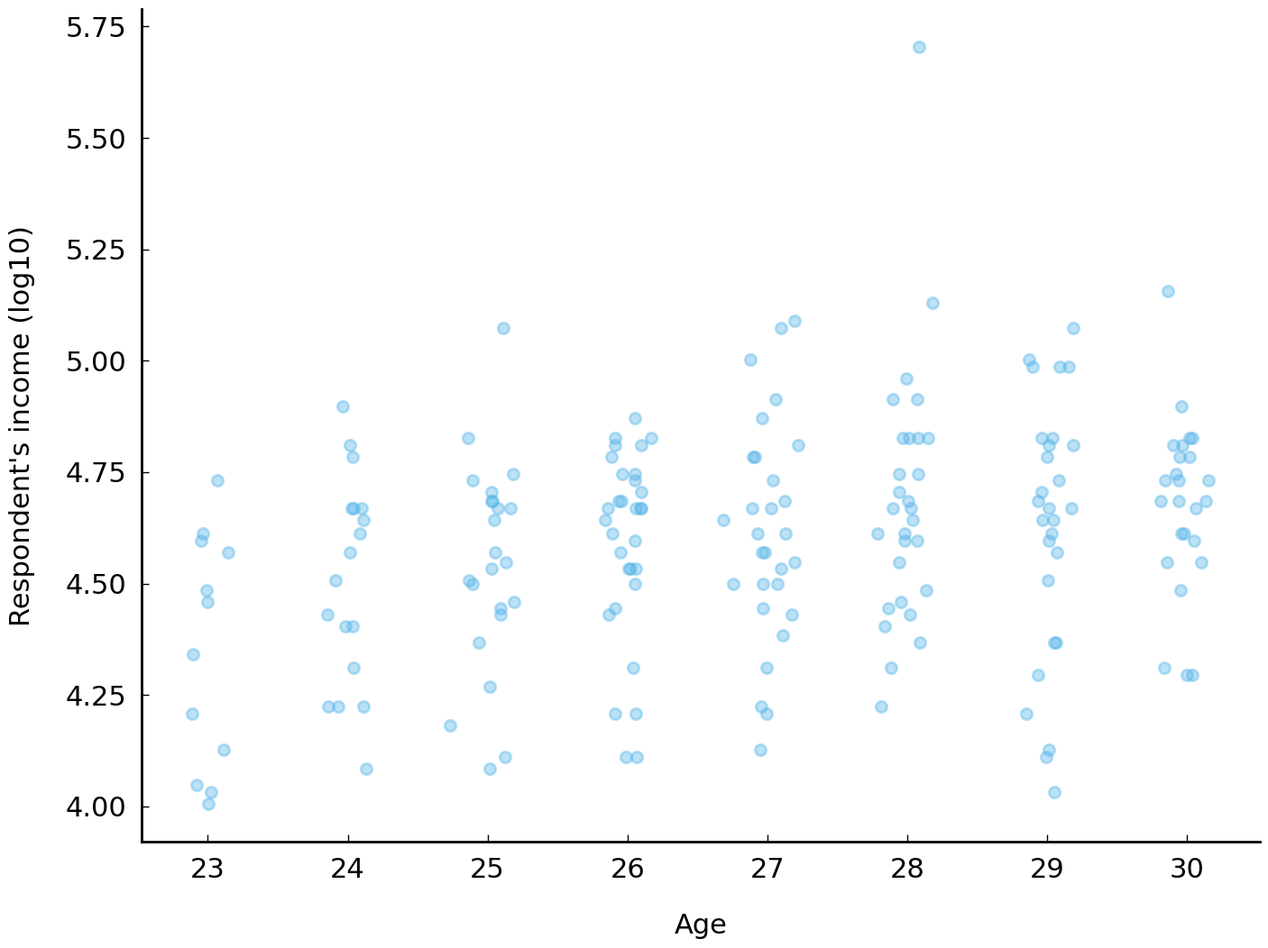
The income of respondents with bachelor’s degrees tends to increase with age. The median income of a 23-year-old with a bachelor’s degree is roughly $25,000 (\(10^{4.4}\)) and the median income of a 30-year-old with a bachelor’s degree is roughly $48,000 (\(10^{4.7}\)). Looking at the incomes for respondents with ages between 23 and 30, it seems like median income increases about 8% each year. Using the \(\log_{10}\) scale, we express this by saying that log income rises by 0.035 each year (\(10^{0.035} - 1 \approx 8\%\)). This account of the relationship between income and age (between 23 and 30) is sufficiently simple that it can be captured in an equation which relates log income to age: \(\text{log income} \approx 0.035 \times \text{age} + 3.67\). This equation conveniently provides a procedure for estimating log income of a respondent given their age: multiply their age by the number 0.035 and add 3.67.
This equation also describes a line. The following code block overlays this line on the first scatter plot:
ax = df_subset.plot(x='age_jitter', y='realrinc2015_log10', kind='scatter', alpha=0.4)
slope, intercept = 0.035, 3.67
xs = np.linspace(23 - 0.2, 30 + 0.2)
label = f'y = {slope:.3f}x + {intercept:.2f}'
ax.plot(xs, slope * xs + intercept, label=label)
ax.set(ylabel="Respondent's income (log10)", xlabel="Age")
ax.legend();
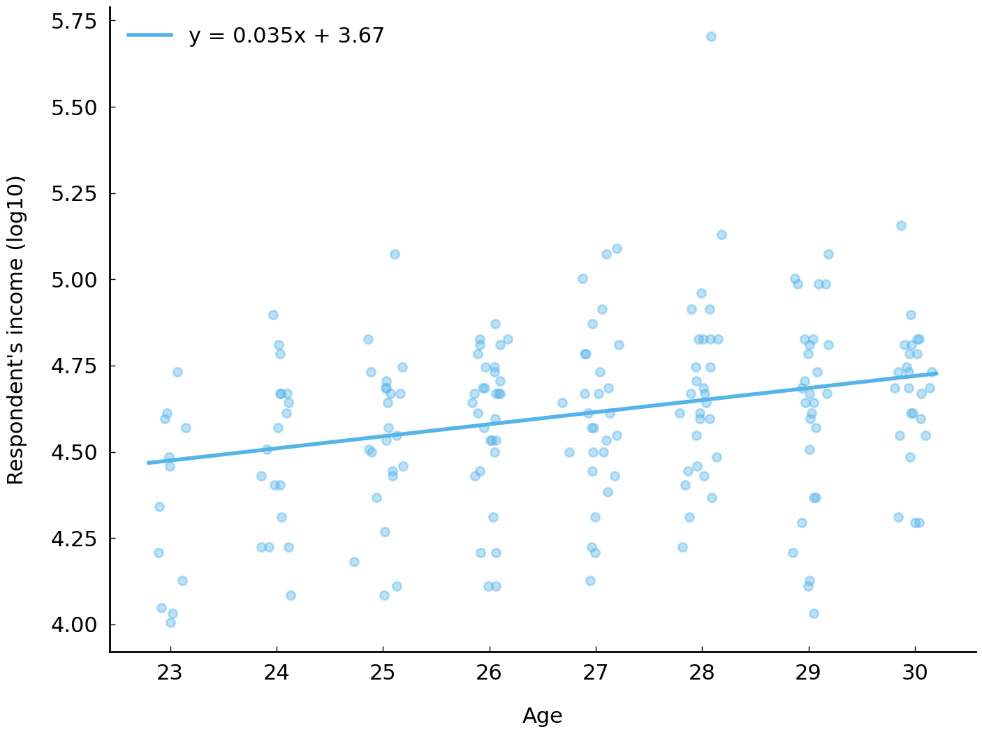
There are other, less concise, ways of describing the relationship between log income and age. For example, the curve in Fig. 14 does seem to summarize the association between log income and age better. In particular, the curve seems to capture a feature of the association visible in the data: that the association between age and income decreases over time. A curve captures this idea. A straight line cannot.
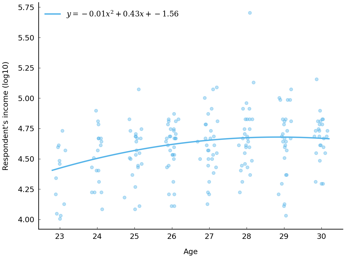
Fig. 14 Relationship between household income and age (jitter added) of respondent. The curve proposes a quadratic relationship between the two variables.#
Spearman’s rank correlation coefficient and Kendall’s rank correlation coefficient#
There are two frequently used summary statistics which express simply how reliably one variable will
increase (or decrease) as another variable increases (or decreases): Spearman’s rank correlation
coefficient, often denoted with \(\rho\), and Kendall’s rank correlation coefficient, denoted \(\tau\).
As their full names suggest, these statistics measure similar things. Both measures distill the
association between two variables to a single number between -1 and 1, where positive values
indicate a positive monotonic association and negative values indicate a negative monotonic association. The
DataFrame class provides a method DataFrame.corr() which can calculate a variety of correlation
coefficients, including \(\rho\) and \(\tau\). As the code below demonstrates, the value of \(\tau\) which
describes the correlation between age and log income is positive, as we expect.
df_subset[['age', 'realrinc2015_log10']].corr('kendall')
| age | realrinc2015_log10 | |
|---|---|---|
| age | 1.000000 | 0.159715 |
| realrinc2015_log10 | 0.159715 | 1.000000 |
There are innumerable other kinds of relationships between two variables that are well approximated by mathematical functions. Linear relationships and quadratic relationships such as those shown in the previous two figures are two among many. For example, the productivity of many in-person collaborative efforts involving humans—-such as, say, preparing food in a restaurant’s kitchen— rapidly increases as participants beyond the first arrive (due, perhaps, to division of labor and specialization) but witnesses diminishing returns as more participants arrive. And at some point, adding more people to the effort tends to harm the quality of the collaboration. (The idiom “too many cooks spoil the broth” is often used to describe this kind of setting.) Such a relationship between the number of participants and the quality of a collaboration is poorly approximated by a linear function or a quadratic function. A better approximation is a curvilinear function of the number of participants. In such settings, adding additional workers improves the productivity of the collaboration but eventually adding more people starts to harm productivity—but not quite at the rate at which adding the first few workers helped. If you believe such a relationship exists between two variables, summary statistics such as Spearman’s \(\rho\) and Kendall’s \(\tau\) are unlikely to capture the relationship you observe. In such a setting you will likely want to model the (non-linear) relationship explicitly.
Measuring association between categories#
In historical research, categorical data are ubiquitous. Because categorical data are often not
associated with any kind of ordering we cannot use quantitative measures of monotonic association.
(The pacific states, such as Oregon, are not greater or less than the new england states, such as
New York.) To describe the relationship between category-valued variables then, we need to look for
new statistics.
In our dataset we have several features which are neither numeric nor ordered, such as information
about where in the country a respondent grew up (reg16) and the highest educational degree they
have received (degree). The variable readfict is also
a categorical variable. It is easy to imagine that we might want to talk about the association
between the region an individual grew up in and their answers to other questions, yet we cannot use
the statistics described in the previous section because these categories lack any widely agreed
upon ordering. There is, for example, no sense of ordering of gender or the region the respondent
lived in at age 16, so we cannot calculate a correlation coefficient such as Kendall’s \(\tau\).
Traditionally, the starting point for an investigation into possible associations between two
categorical-valued variables begins with a table (a contingency table or cross tabulation)
recording the frequency distribution of the responses. The crosstab() function in the Pandas
library will generate these tables. The following contingency table shows all responses to the
question concerning fiction reading (readfict) and the question concerning the region of
residence at age 16 (reg16):
df_subset = df.loc[df['readfict'].notnull(), ['reg16', 'readfict']]
pd.crosstab(df_subset['reg16'], df_subset['readfict'], margins=True)
| readfict | yes | no | All |
|---|---|---|---|
| reg16 | |||
| foreign | 67 | 33 | 100 |
| new england | 73 | 26 | 99 |
| middle atlantic | 198 | 72 | 270 |
| e. nor. central | 247 | 87 | 334 |
| w. nor. central | 109 | 28 | 137 |
| south atlantic | 178 | 98 | 276 |
| e. sou. central | 90 | 45 | 135 |
| w. sou. central | 123 | 53 | 176 |
| mountain | 66 | 31 | 97 |
| pacific | 154 | 36 | 190 |
| All | 1305 | 509 | 1814 |
Contingency tables involving categorical variables taking on a small number of possible
values (such as the one shown above) may be visualized conveniently by a stacked or
segmented bar plot. The relative density of (self-reported) fiction readers across the
regions of the United States is easier to appreciate in the visualization below, which is
created by using the plot.bar(stacked=True) method on the DataFrame created by the
pandas.crosstab() function:
pd.crosstab(df_subset['reg16'], df_subset['readfict']).plot.barh(stacked=True);
# The pandas.crosstab call above accomplishes the same thing as the call:
# df_subset.groupby('reg16')['readfict'].value_counts().unstack()
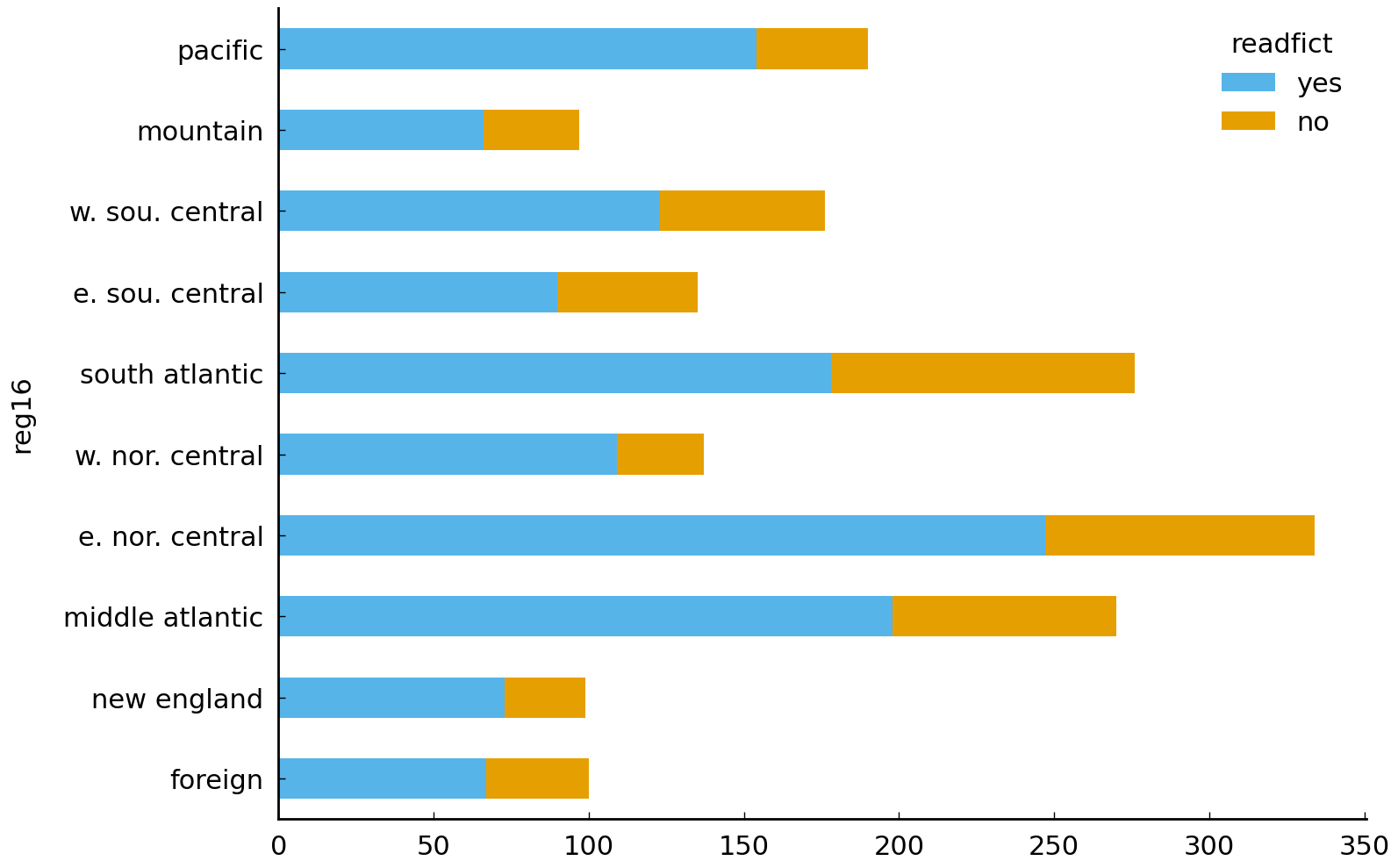
While the data shown in the table has a clear interpretation, it is still difficult to extract useful information out of it. And it would be harder still if there were many more categories. One question to which we justifiably expect an answer from this data asks about the geographical distribution of (self-reported) readers of fiction. Do certain regions of the United States tend to feature a higher density of fiction readers? If they did, this would give some support to the idea that reading literature varies spatially and warrant attention to how literature is consumed in particular communities of readers. (This suggestion is discussed in {cite:t}`radway1991reading, 4.) Is it reasonable to believe that there is a greater density of fiction readers in a Pacific state like Oregon than in a New England state such as New Jersey? The stacked bar plot does let us see some of this, but we would still be hard-pressed to order all the regions by the density of reported fiction reading.
We can answer this question by dismissing, for the moment, a concern about the global distribution
of responses and focusing on the proportion of responses which are “yes” or “no” in each region
separately. Calculating the proportion of responses within a region, given the cross tabulation,
only requires dividing by the sum of counts across the relevant axis (here the rows). To further
assist our work, we will also sort the table by the proportion of “yes” responses. The relevant
parameter for pandas.crosstab() is normalize, which we need to set to index to normalize the rows.
pd.crosstab(df_subset['reg16'], df_subset['readfict'], normalize='index').sort_values(
    by='yes', ascending=False)
| readfict | yes | no |
|---|---|---|
| reg16 | ||
| pacific | 0.810526 | 0.189474 |
| w. nor. central | 0.795620 | 0.204380 |
| e. nor. central | 0.739521 | 0.260479 |
| new england | 0.737374 | 0.262626 |
| middle atlantic | 0.733333 | 0.266667 |
| w. sou. central | 0.698864 | 0.301136 |
| mountain | 0.680412 | 0.319588 |
| foreign | 0.670000 | 0.330000 |
| e. sou. central | 0.666667 | 0.333333 |
| south atlantic | 0.644928 | 0.355072 |
A stacked bar plot expressing the information on this table can be made using the same method
plot.bar(stacked=True) that we used before:
pd.crosstab(
    df_subset['reg16'], df_subset['readfict'], normalize='index').plot.barh(stacked=True);
plt.legend(loc="upper center", bbox_to_anchor=(0.5, 1.15), ncol=2, title="Read fiction?");
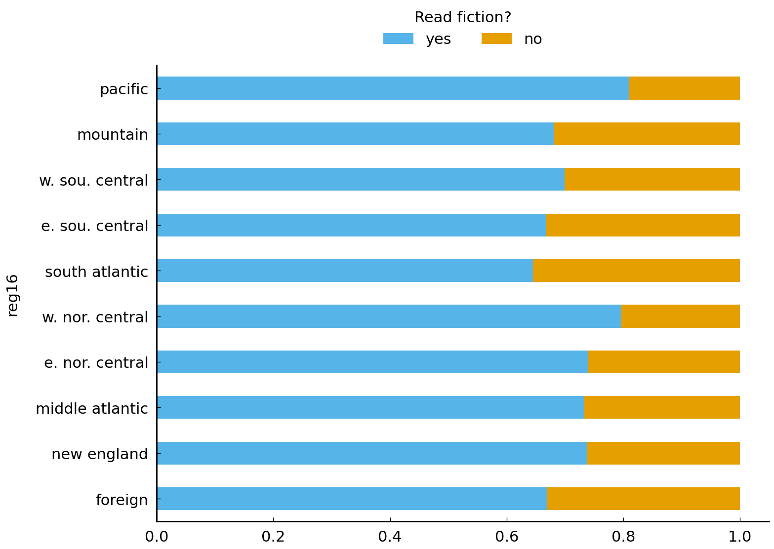
From this plot it is possible to see that the observed density of readfict “yes”
responders is lowest in states assigned the south atlantic category (e.g., South
Carolina) and highest in the states assigned the pacific category.
The differences between regions are noticeable, at least visually. We have respectable sample sizes
for many of these regions so we are justified in suspecting that there may be considerable
geographical variation in the self-reporting of fiction reading. With smaller sample sizes, however, we would
worry that a difference visible in a stacked bar chart or a contingency table may well be due to
chance: for example, if “yes” is a common response to the readfict question and many people grew
up in a pacific state, we certainly expect to see people living in the pacific states and
reporting reading fiction in the last twelve months even if we are confident that fiction reading is
conditionally independent from the region a respondent grew up in.
Mutual information#
This brief section on mutual information assumes the reader is familiar with discrete probability distributions and random variables. Readers who have not encountered probability before may wish to skip this section.
Mutual information is a statistic which measures the dependence between two categorical variables (Cover and Thomas [2006], Chp 2). If two categorical outcomes co-occur no more than random chance would predict, mutual information will tend to be near zero. Mutual information is defined as follows:
where \(X\) is a random variable taking on values in the set \(\mathcal{X}\) and Y is a random variable taking on values in \(\mathcal{Y}\). As we did with entropy, we use the empirical distribution of responses to estimate the joint and marginal distributions needed to calculate mutual information. For example, if we were to associate the response to readfict with \(X\) and the response to reg10 as \(Y\), we would estimate \(\Pr(X = \text{yes}, Y = \text{pacific})\) using the relative frequence of that pair of responses among all the responses recorded.
Looking closely at the mutual information equation, it is possible to appreciate why the mutual information between two variables will be zero if the two are statistically independent: each \(\frac{\Pr(X=x,Y=y)}{\Pr(X=x)\Pr(Y=y)}\) term in the summation will be 1 and the mutual information (the sum of the logarithm of these terms) will be zero as \(\log 1 = 0\). When two outcomes co-occur more often than chance would predict the term \(\frac{\Pr(X=x,Y=y)}{\Pr(X=x)Pr(Y=y)}\) will be greater than 1.
We will now calculate the mutual information for responses to the reg16 question and answers to the
readfict question.
# Strategy:
# 1. Calculate the table of Pr(X=x, Y=y) from empirical frequencies
# 2. Calculate the marginal distributions Pr(X=x)Pr(Y=y)
# 3. Combine above quantities to calculate the mutual information.

joint = pd.crosstab(df_subset['reg16'], df_subset['readfict'], normalize='all')

# construct a table of the same shape as joint with the relevant
# values of Pr(X = x)Pr(Y = y)
proba_readfict, proba_reg16 = joint.sum(axis=0), joint.sum(axis=1)
denominator = np.outer(proba_reg16, proba_readfict)

mutual_information = (joint * np.log(joint / denominator)).sum().sum()
print(mutual_information)
0.006902379486167156
In the cell above we’ve used the function numpy.outer() to quickly construct a table of the
pairwise products of the two probability distributions. Given an array \(v\) of length \(n\) and an
array \(u\) of length \(m\), numpy.outer() will multiply elements from the two arrays to construct an
\(n \times m\) array where the entry with index \(i, j\) is the product of the \(i\)th entry of \(v\) and
the \(j\)th entry of \(v\).
Mutual information is always non-negative. Higher values indicate greater dependence. Performing the same calculation using the degree variable and the readfict variable we find a higher mutual information.
There are many applications of mutual information. This section has documented the quantity’s usefulness for assessing whether or not two variables are statistically independent and for ordering pairs of categorical variables based on their degree of dependence.
Conclusion#
This chapter reviewed the use of common summary statistics for location, dispersion, and association. When distributions of variables are regular, summary statistics are often all we need to communicate information about the distributions to other people. In other cases, we are forced to use summary statistics because we lack the time or memory to store all the observations from a phenomenon of interest. In the preceding sections, we therefore saw how summary statistics could be used to describe salient patterns in responses to the GSS, which is a very useful study in which to apply these summary statistics.
It should be clear that this chapter has only scratched the surface: scholars nowadays have much more complex statistical approaches at their disposal in the (Python) data analysis ecosystem. Nevertheless, calculating simple summary statistics for variables remains an important first step in any data analysis, especially when still in exploratory stages. Summary statistics help one think about the distribution of variables, which is key to carrying out (and reporting) sound quantitative analyses for larger datasets—which a scholar might not have created herself or himself and thus might be unfamiliar with. Additionally, later in this book, the reader will notice how seemingly simple means and variances are often the basic components of more complex approaches. Burrows’s Delta, to name but one example, is a distance measure from stylometry which a researcher will not be able to fully appreciate without a solid understanding of concepts such as mean and standard deviation.
The final section of this chapter looked into a number of basic ways of measuring the association between variables. Summary measures of association often usefully sharpen our views of the correlations that typically are found in many datasets and can challenge us to come up with more parsimonious descriptions of our data. Here too, the value of simple and established statistics for communicating results should be stressed: one should think twice about using a more complex analysis, if a simple and widely understood statistic can do the job.
Further Reading#
While it is not essential to appreciate the use of summary statistics, an understanding of probability theory allows for a deeper understanding of the origins of many familiar summary statistics. For an excellent introduction to probability, see Grinstead and Snell [2012]. Mutual information is covered in chapter 2 of Cover and Thomas [2006].
Exercises#
The Tate galleries consist of four art museums in the United Kingdom. The museums – Tate Britain, Tate Modern in London, Tate Liverpool, and Tate St. Ives in Cornwall – house the United Kingdom’s national collection of British art, as well as an international collection of modern and contemporary art. Tate has made available metadata for approximately 70,000 of its artworks. In the following set of exercises, we will explore and describe this dataset using some of this chapter’s summary statistics.
A CSV file of these metadata is stored in the data folder, tate.csv, in compressed
form tate.csv.gz. We decompress and load it with the following lines of code:
tate = pd.read_csv("data/tate.csv.gz")
# remove objects for which no suitable year information is given:
tate = tate[tate['year'].notnull()]
tate = tate[tate['year'].str.isdigit()]
tate['year'] = tate['year'].astype('int')
Easy#
The dataset provides information about the dimensions of most artworks in the collection (expressed in millimeters). Compute the mean and median width (column
width), height (columnheight), and total size (i.e., the length times the height) of the artworks. Is the median a better guess than the mean for this sample of artworks?Draw histograms for the width, height, and size of the artworks. Why would it make sense to take the logarithm of the data before plotting?
Compute the range of the width and height in the collection. Do you think the range is an appropriate measure of dispersion for these data? Explain why you think it is or isn’t.
Moderate#
With the advent of postmodernism, the sizes of the artworks became more varied and extreme. Make a scatter plot of the artworks’ size (Y axis) over time (X axis). Add a line to the scatter plot representing the mean size per year. What do you observe? (Hint: use the column
year, convert the data to a logarithmic scale for better visibility, and reduce the opacity (e.g.,alpha=0.1) of the dots in the scatter plot.)To obtain a better understanding of the changes in size over time, create two box plots which summarize the distributions of the artwork sizes from before and after 1950. Explain the different components of the box plots. How do the two box plots relate to the scatter plot in the previous exercise?
In this exercise, we will create an alternative visualization of the changes in shapes of the artworks. The following code block implements the function
create_rectangle(), with which we can draw rectangles given a specified width and height 3.import matplotlib def create_rectangle(width, height): return matplotlib.patches.Rectangle( (-(width / 2), -(height / 2)), width, height, fill=False, alpha=0.1) fig, ax = plt.subplots(figsize=(6, 6)) row = tate.sample(n=1).iloc[0] # sample an artwork for plotting ax.add_patch(create_rectangle(row['width'], row['height'])) ax.set(xlim=(-4000, 4000), ylim=(-4000, 4000))
Sample 2,000 artworks from before 1950, and 2,000 artworks created after 1950. Use the code from above to plot the shapes of the artworks in each period in two separate subplots. Explain the results.
Challenging#
The
artistcolumn provides the name of the artist of each artwork in the collection. Certain artists occur more frequently than others, and in this exercise, we will investigate the diversity of the Tate collection in terms of its artists. First, compute the entropy of the artist frequencies in the entire collection. Then, compute and compare the entropy for artworks from before and after 1950. Describe and interpret your results.For most of the artworks in the collection, the metadata provides information about what subjects are depicted. This information is stored in the column
subject. Works of art can be assigned to one or more categories, such as “nature”, “literature and fiction”, and “work and occupations”. In this exercise we investigate the associations and dependence between some of the categories. First calculate the mutual information between the categories “emotions” and “concepts and ideas”. What does the relatively high mutual information score mean for these concepts? Next, compute the mutual information between “nature” and “abstraction”. How should we interpret the information score between these categories? (Hint: to compute the mutual information between categories, it might be useful to first convert the data into a document-term matrix.)In the blog post, The Dimensions of Art, that gave us the inspiration for these exercises, James Davenport makes three interesting claims about the dimensions of the artworks in the Tate Collections. We quote the author in full:
On the whole, people prefer to make 4x3 artwork: This may largely be driven by stock canvas sizes available from art suppliers.
There are more tall pieces than wide pieces: I find this fascinating, and speculate it may be due to portraits and paintings.
People are using the Golden Ratio: Despite any obvious basis for its use, there are clumps for both wide and tall pieces at the so-called “Golden Ratio”, approximately 1:1.681 […].
Can you add quantitative support for these claims? Do you agree with James Davenport on all statements?
- 1
The official site for the General Social Survey is http://gss.norc.org/ and the data used in this chapter is the cumulative dataset “GSS 1972-2014 Cross-Sectional Cumulative Data (Release 5, March 24, 2016)” which was downloaded from http://gss.norc.org/get-the-data/stata on May 5, 2016. While this chapter only uses data from between 1998 and 2002, the cumulative dataset includes useful variables such as respondent income in constant dollar terms (
realrinc), variables which are not included in the single-year datasets.- 2
A simple random sample of items in a collection is assembled by repeatedly selecting an item from the collection, given that the chance of selecting any specific item is equal to the chance of selecting any other item.
- 3
The idea for this exercise was taken from a blog post, The Dimensions of Art, by James Davenport.